Here is my type design of a passage from The Tragedy of Macbeth:

Research:
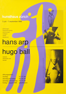
A point in typography is the smallest unit of measure. The printer’s point used to vary, but is now standardized, by making the point 1/72 inches. There are 12 points in every pica, regardless of which system is being used. The EM of a font is the size determines how large the typeface is. Not all typefaces are the same height. A grid is a structure, that is usually two dimensional and serves as a guide and to structure content in design. Grids helps organize elements of design. Josef Muller-Brockmann was a swiss graphic designer and teacher who studied arcutecture, design, and history of art in two different schools. He opened a studio in Zurich that specialized in graphic design, exhibition design, and photography. Here are some examples of his work:

A typeface, or font family, is a set of one or more fonts, each composed that are composed of glyphs that have similar features. Each font has different styles and attributes that makes it unique from other fonts. Fonts are the variations of typeface like the shape and size of text. A typeface is a set of fonts, or the whole family. In the family, there are different fonts that differ in size and weight. Glyphs are organic graphic elements that make up typefaces. They are individual marks of writing that contribute to the letter or word.
Pre-Assignment:
Designing with Type
http://typeneue.com/inconsolata-normal/
Read through this blog on type. Outline some of the key points on your blog.
What is the smallest unit of measure in typography?
How many points in a pica?
EM square -- ask me about it it's confusing in this article.
In graphic design, what is a grid and how is it used?
Who is Josef Muller-Brockmann? (find samples of his designs, and post on your blog)
What is a typeface?
What is a font?
How are they different?
What are glyphs?
What is interesting about this blog is that it repeats the same information, but each month they use a different font. It is a great way to visually experience different fonts.
For your assignment you will find a favorite passage or poem in a book -- find an online resource where you can copy and paste. Create a work of art, 8.5 x 11 that highlights three different typefaces. Think about how you will combine the three typefaces of the same passage into one design. Will you use different shades of grey overlapping the type? Will you use a color? All different colors? The only rule is that it must be readable.
When you work in photoshop make sure that each of the three typeface passages are on separate layers. You will have to turn off layers to change the text of one, I'll demonstrate this in class.
Have fun with this!
Just finish the 'quiz' and you are golden! You type design is creative. I like it. But with Macbeth, I think it could be even more dramatic and strong... what would you do to achieve that? Maybe a background color... hmmm worth thinking about.
ReplyDelete