Friday, October 25, 2013

This is Colossal Research


A Dragon Teapot by Johnson Tsang tea sculpture ceramics


Looking through this website, I found a few things that I think a re pretty cool. One of them was a Dragon Teapot that can be found here. This includes some extreme detail, and has an ancient Chinese style to it that makes it look authentic. The head of the dragon is my favorite, because it has the detail of the teeth and inside the mouth, as well as the expression on the dragons face. Making that out of clay must have been very difficult and even more tedious.


The Dino Pet: A Living, Bioluminescent Pet toys light dinosaurs biology
A second design I liked was "The Dino Pet," which has bio-luminescent algae that give off light. I like how it was used in the video while someone was surfing. The algae begins to glow after photosynthesize in the day, or when they are agitated. I like the Dino Pet because it combines art and science to make a cool and different product.

Wednesday, October 23, 2013

Holiday Card Project

Post-Assignment:
Thinking of ways to incorporate the Gloucester Education Foundation hands into a holiday card that was neutral to all beliefs was difficult at first. I started by just adding the hands to the design, and then moving them around, and I decided to put them around the "Season's Greetings." I was going to have all the hands either holding something or doing something instead of just being there, but it would have been to much going on in the card I think. I made one hand hold mistletoe, which I think adds a little color to the design and makes it less boring. The starry background also goes with the winter holiday theme but does not favor any one belief. The second card I made, I wanted to be brighter and use more color, so I started with a gradient background that looked like it was sunset, and then went on to add things that I thought of, when I thought of winter. I made the snowman and reindeer out of geometric shapes with sharp corners first, and then added a similar style tree and sled. I used the outline of a dove I found that was not copyrighted, and still looked similar to the rest of the card. Choosing a font that fit that style of he roundness of the snowman and the geometric shapes that I also included in my design was difficult. My selection was not too big, but I managed to find a font that I think works well. The only problem I had with the font was the dot above the "i," which was very small and off-centered. I decided to take it out and replace it with a snowflake, because that was winter themed and looked better. I did my research for the project while working on the project, because I had an idea of what a holiday card is supposed to look like. I did most of my research one my second card, because I needed to know what certain things looked like and I needed ideas of things to add to my card to make it less empty. I think that I filled up the space of both my cards well, and they do not look overcrowded. After seeing some other people's designs, I think I could have incorporated the hands better in my first card. I think they could have been doing something more, but I wouldn't know how to do that with the design I started with. To get the hands for the first holiday card, I googled "Gloucester Education Foundation," and found a large photo, but it wouldn't let me save it. Instead, I took a screenshot and pasted it in Photoshop to select the hands and copy them into my design.


Pre-Assignment:


Holiday Card for the GEF

You will design two holiday cards for the Gloucester Education Foundation.  One of the card designs will use their logo as an element in the design. The second design is open to your creativity.  However there are some 'rules.'

1. The holiday theme must not be any one faith, for example you can't use a Christmas Tree, because not everyone celebrates Christmas.

2. If you use an image you must make sure that it is a copyright free open source image or you get permission from the owner of the image.  For example if you have a talented friend who can draw, you can ask them for art work to use in your card.  Or if you find a photograph you love you can email the photographer and ask for permission to use the image. If you tell them it is for a non-profit organization, and you are a student doing the design for them they often will let you use it for free.

3. The card size must be 5.5 x 7.5 inches and you must have a .5 image free area around the whole image.  This is the cut zone. When the card is printed and cut, some of the image area will end up on the cutting room floor, make sure important information is not cut off.

Advice:  Choose your font wisely, some fonts will 'break up' when they are printed, for example TRAJAN PRO serifs are so thin that they will not print and the words will break apart. Also make sure you choose the right font for your message.  If it is a playful image find a playful font. If it is formal, like "season's greetings' make sure you use a formal font.  ASK ME WHAT THE DIFFERENCE IS BETWEEN A FORMAL AND PLAYFUL FONT IF YOU DON'T KNOW.


Monday, October 7, 2013

Designing with Type

Here is my type design of a passage from The Tragedy of Macbeth:


Research:

A point in typography is the smallest unit of measure. The printer’s point used to vary, but is now standardized, by making the point 1/72 inches. There are 12 points in every pica, regardless of which system is being used. The EM of a font is the size determines how large the typeface is. Not all typefaces are the same height. A grid is a structure, that is usually two dimensional and serves as a guide and to structure content in design. Grids helps organize elements of design. Josef Muller-Brockmann was a swiss graphic designer and teacher who studied arcutecture, design, and history of art in two different schools. He opened a studio in Zurich that specialized in graphic design, exhibition design, and photography. Here are some examples of his work:


A typeface, or font family, is a set of one or more fonts, each composed that are composed of glyphs that have similar features. Each font has different styles and attributes that makes it unique from other fonts. Fonts are the variations of typeface like the shape and size of text. A typeface is a set of fonts, or the whole family. In the family, there are different fonts that differ in size and weight. Glyphs are organic graphic elements that make up typefaces. They are individual marks of writing that contribute to the letter or word.

Pre-Assignment: 


Designing with Type

http://typeneue.com/inconsolata-normal/

Read through this blog on type.  Outline some of the key points on your blog.


What is the smallest unit of measure in typography?


How many points in a pica?


EM square -- ask me about it it's confusing in this article.


In graphic design, what is a grid and how is it used?


Who is Josef Muller-Brockmann? (find samples of his designs, and post on your blog)


What is a typeface?


What is a font?


How are they different?


What are glyphs?


What is interesting about this blog is that it repeats the same information, but each month they use a different font.  It is a great way to visually experience different fonts.


For your assignment you will find a favorite passage or poem in a book -- find an online resource where you can copy and paste.  Create a work of art, 8.5 x 11 that highlights three different typefaces.  Think about how you will combine the three typefaces of the same passage into one design.  Will you use different shades of grey overlapping the type? Will you use a color? All different colors?  The only rule is that it must be readable.


When you work in photoshop make sure that each of the three typeface passages are on separate layers. You will have to turn off layers to change the text of one, I'll demonstrate this in class.


Have fun with this!

Friday, October 4, 2013

Constuctivism Assignment


Assignment:


Unit Exam Project

You will create one large image -- 8" x 11" to hand in as a unit test on the elements and principles of design.

Using only geometric shapes you will create a design composition.  Unlike your six designs, you may vary your geometric shapes in this way: 1. you may add one other color. and 2. you can use 50% transparency on some of the the geometric shapes.  3. you may use a color background.


Look up Constructivism-- on your blog write about this form of art, what it means, and whose works you like.  DUE: October 4.


PAINTINGS FROM THE TATE GALLERY:

John Cecil Stephenson

László Moholy-Nagy, ‘K VII’ 1922László Moholy-Nagy

Post-assignment Evaluation:


Before starting this project, I searched for constructivist artists and their work. I found many designs that included basic geometric shapes that included shading, texture, and depth. A common color scheme was red, black, and cream, which are the same colors I used in my design. Shepard Fairey is one modern day constructivism artist that is known for his "Obey" designs. He uses these colors often, and I thought they were colors that worked well together. Constructivism art was a major turning point in Russian culture, and many designs included the word "Change" and a fist or an open hand. I chose to make a fist out of geometric shapes while using the same colors that were common in others artist work. I tried as much as possible to stay with the constructivism theme while making my design, and I fell that I successfully have done that. I made the fist punch through my design and added shards to add movement, and I used a repeating background to move the eye around the design. To make my design better, it may have looked more appealing to the eye if I had done more to separate the fist from the background pattern, but I think that the first can still be seen. It does make it a more abstract design that you have to step back and look at, which isn't necessarily bad.

Tuesday, October 1, 2013

Constructivism

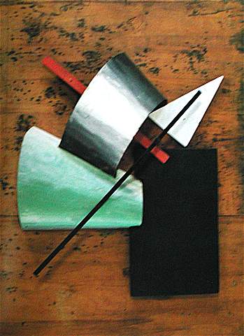
Constructivism was the most recent art movement in Russia that was also considered he most influential. Borrowing styles from others form of art such as cubism, futurism, and suprematism, constructivism used different properties of materials to make something abstract and beautiful works of art. It was a different and more popular form of art that replaced the older styles of art in Russia. The use of geometric shapes that try to appear in a modern style are commonly used in constuctivism.

Vladimir Tatlin made the "Monument to the Third World" which is one piece of constructivism art I find very interesting

Ivan Albertovich Puni made the piece "Reconstruction" in 1915